From strategy to execution
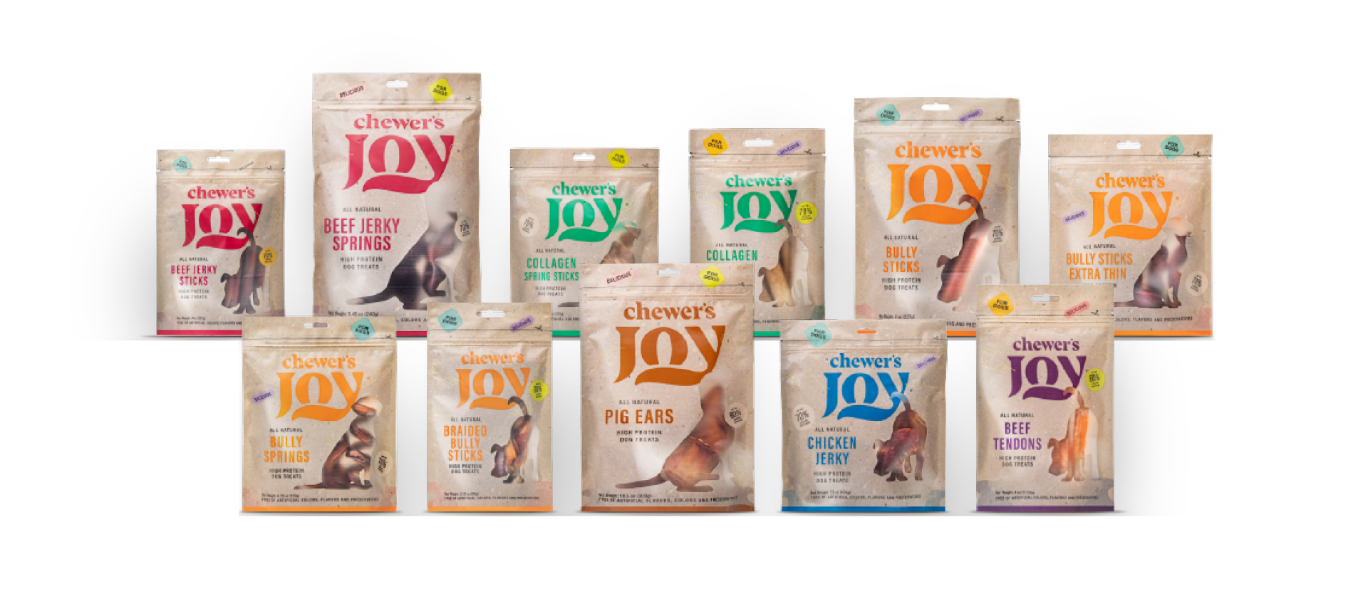
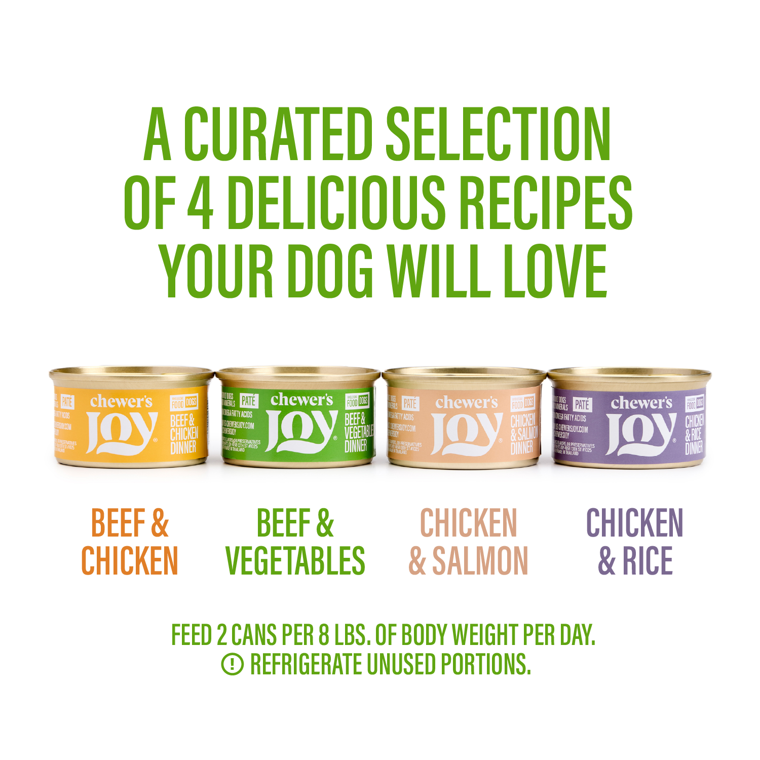
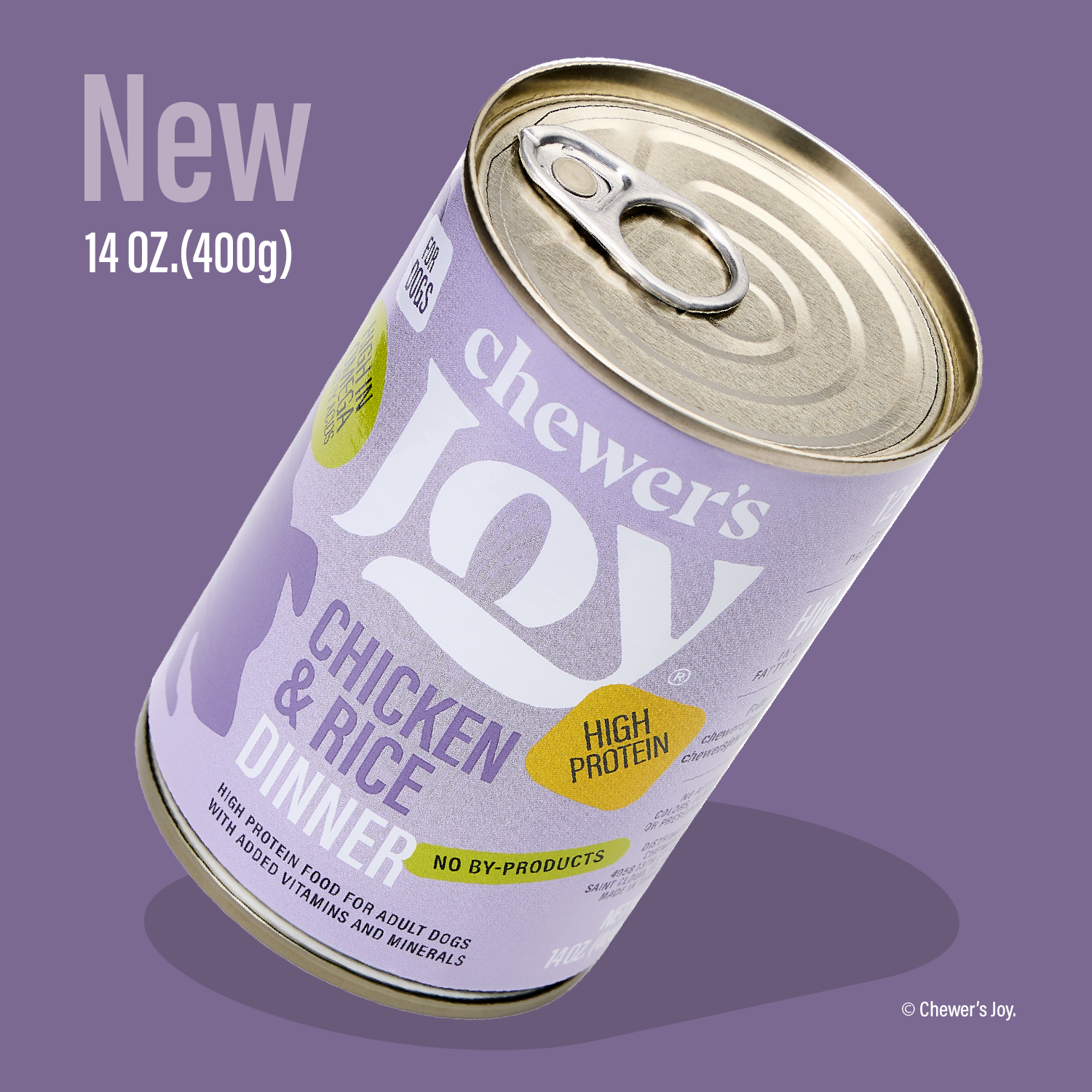
We built and deployed a comprehensive brand system for a new dog and cat food line, defining its positioning, visual language, tone of voice, and brand architecture. This went far beyond packaging — we designed and implemented the entire visual ecosystem across all touchpoints.
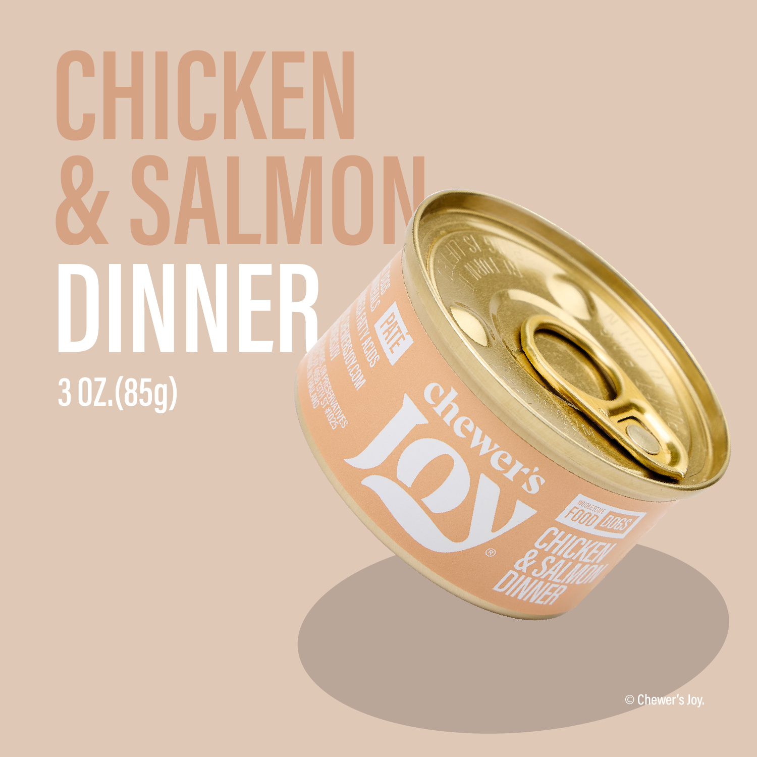
The Logo
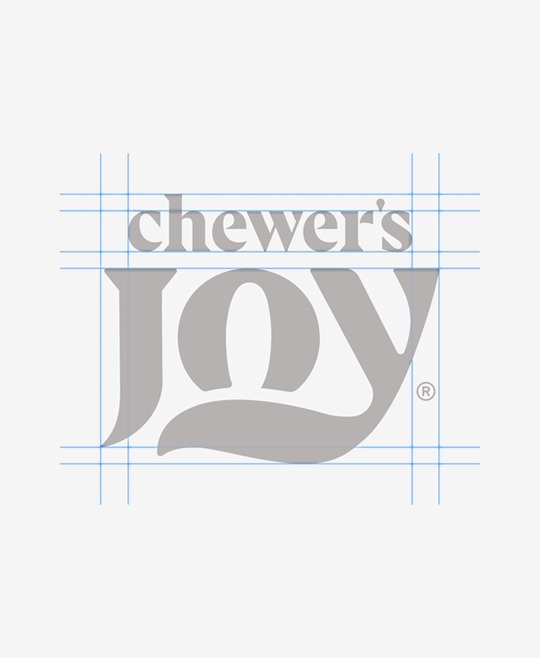
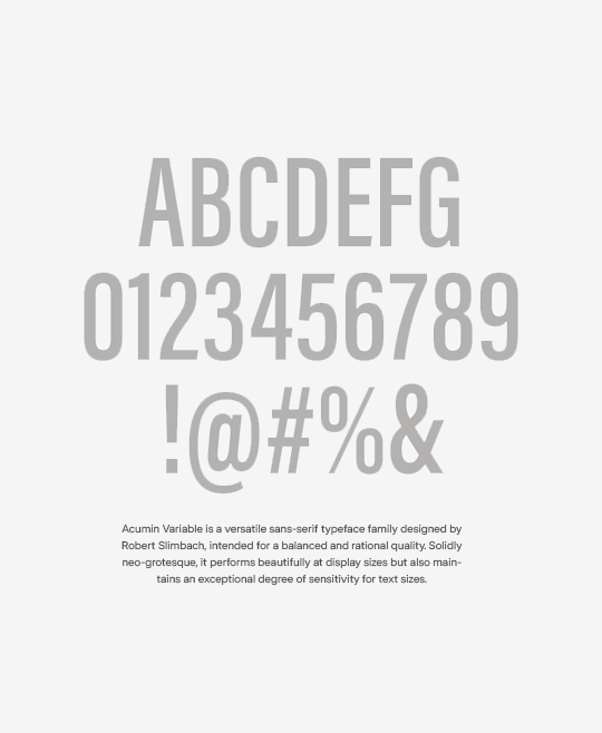
When your logo appears correctly, recognition strengthens. Do not rotate, break apart or mix colors.
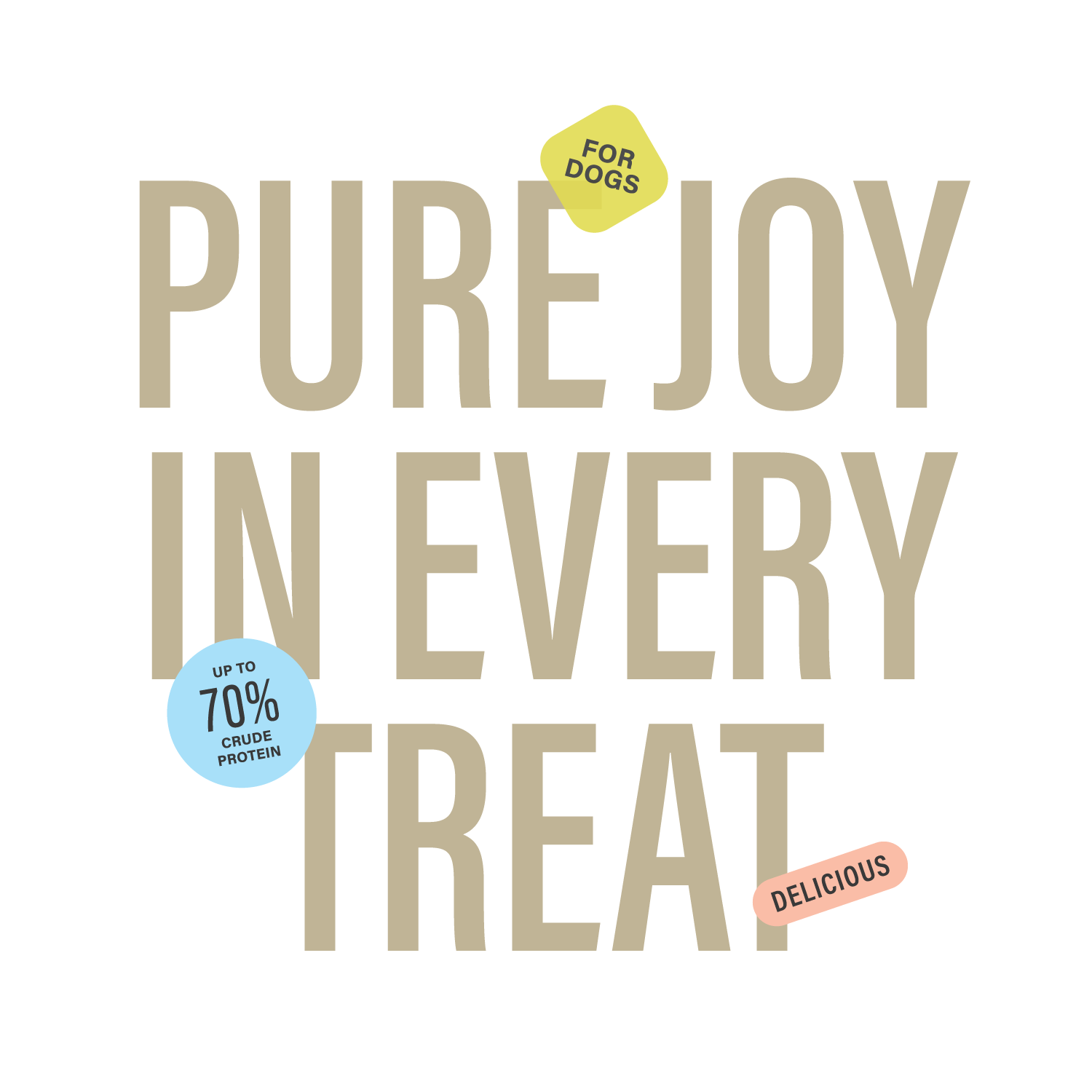
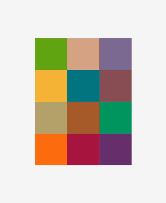
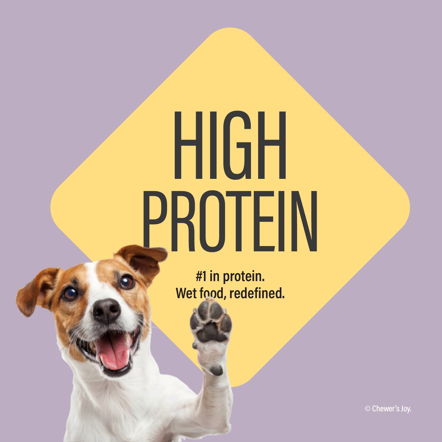
We used a vibrant and eye-catching color palette inspired by diversity, associated with energy, and reality.
Consistent use of these colors across various platforms and promotional materials will help brand recognition.
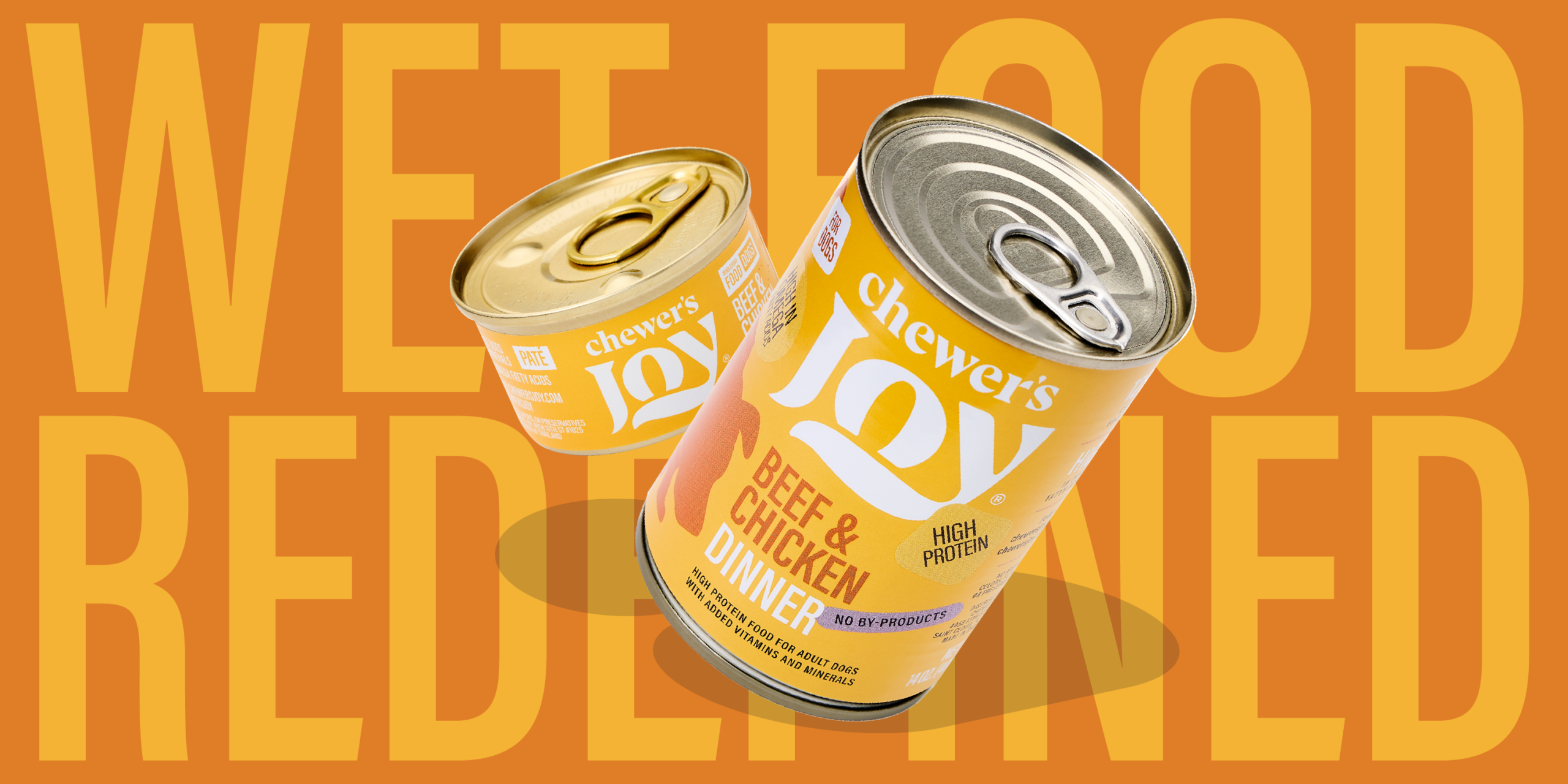
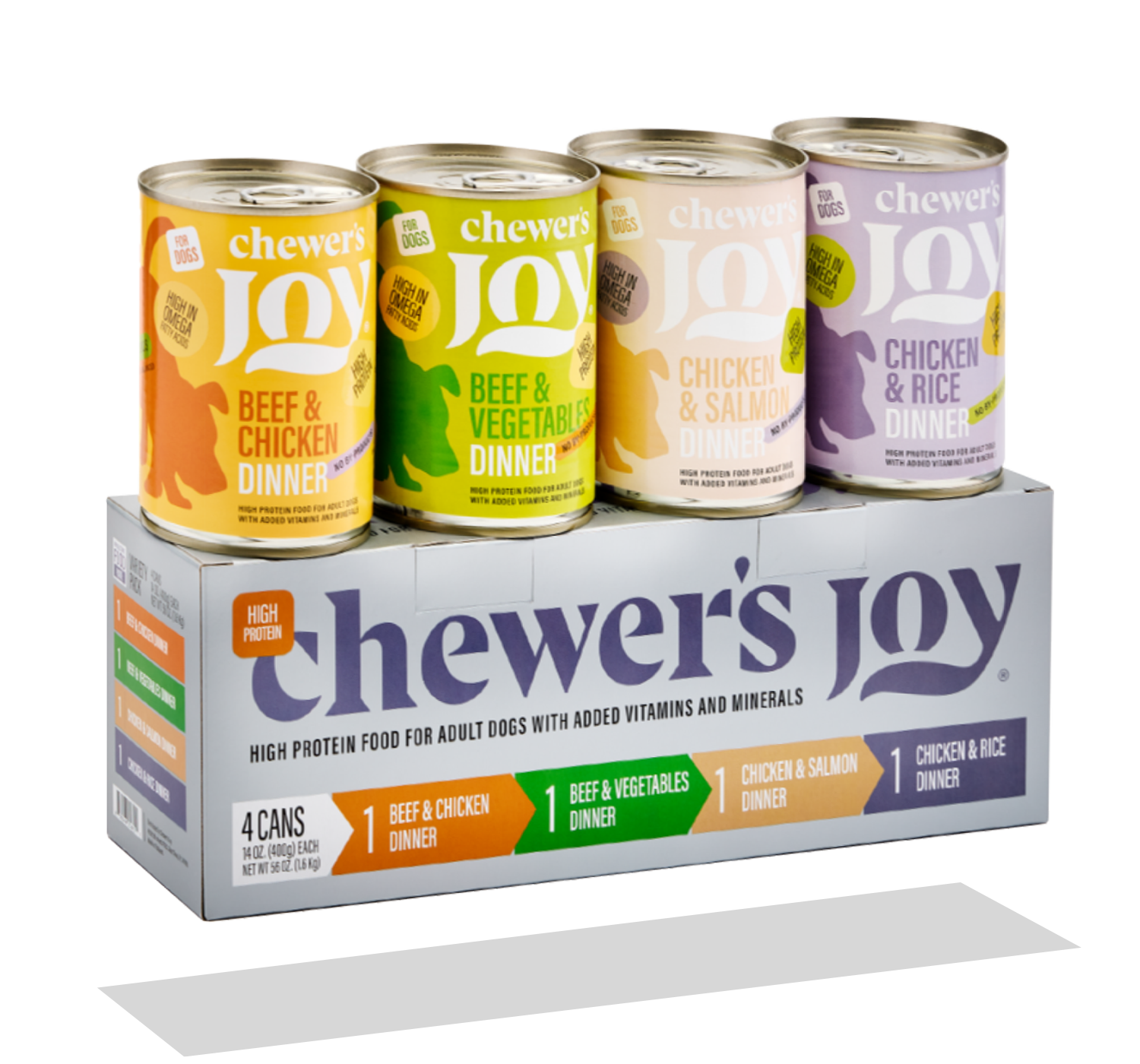
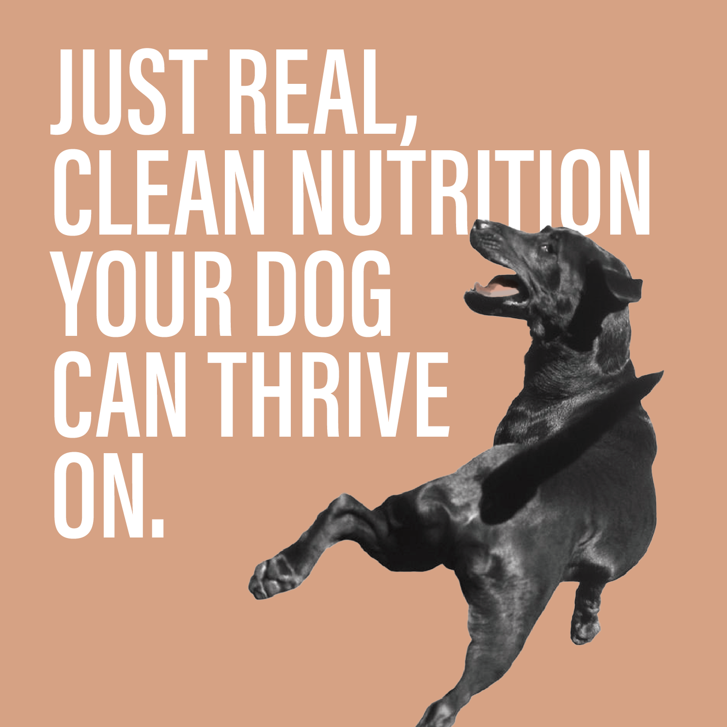
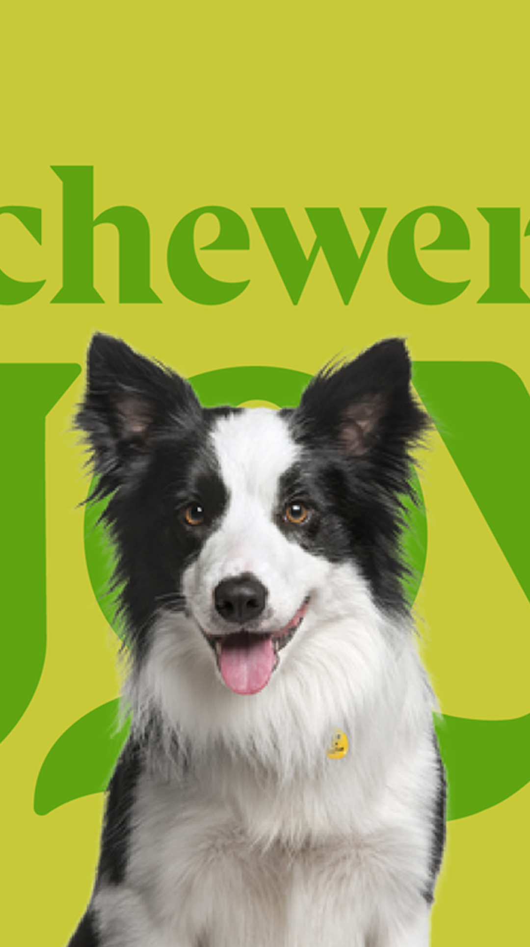
Chewer' Joy is intended for those who love their pets like family — not just animals.
Chewer' Joy is designed for the kind of people who’d cook for their pets if they could.
Chewer' Joy is definitelly for those who feed better out of care, not out of trend.